An effective intranet is more than a digital bulletin board—it’s a cornerstone of workplace productivity, communication, and engagement. However, just having an intranet isn’t enough - it actually needs to be utilized by employees. Poor, outdated intranet design can hinder user adoption, with many intranets failing due to low usage rates caused by clunky navigation or irrelevant content.
This guide explores the essential principles of successful intranet design. It’ll highlight best practices, award-winning examples, and provide practical tips to help you create a platform that drives engagement and collaboration.
From understanding the importance of user experience (UX) to leveraging simple templates and effective homepage designs, this guide will equip you with the insights needed to build an intuitive, inclusive, and user-friendly intranet.
Designing an intranet: the importance of user experience (UX)
Intranet design isn’t just about creative elements such as wireframes, layouts, or visual aesthetics. These are important, but the user experience needs to be the top priority. No amount of advanced tools or exciting imagery can compensate if employees find the platform difficult to navigate.
The International Organization for Standardization defines user experience as:
"A person's perceptions and responses that result from the use or anticipated use of a product, system, or service."
A successful intranet combines creativity with logical planning. Think of it as balancing the art of engagement, with the science of usability. Together, this delivers a seamless employee experience.
Consumer tech's influence on employee digital experiences
Digital innovation, from social networking to smartphones, has rapidly accelerated over the last two decades. On the consumer side, savvy leaders turned to cutting-edge capabilities to optimize the customer journey.
Look no further than Amazon to understand the powerful role that next-generation technology plays in enhancing the consumer experience. Much of the e-commerce giant's rise is thanks to their ability to create a seamless purchasing journey. Through Google-like search abilities, recommender systems, and on-demand services – Amazon cultivates top-tier interactions from start to finish.
While personalized products and instant gratification became hallmarks of digital consumer experiences, workplace technology was initially slow to evolve. A 2019 Deloitte survey found that just 38% of workers reported feeling satisfied or very satisfied with workplace tools. The same research indicated that enterprises which went the extra mile for their employees reaped significant pay-offs – including a 12% greater consumer satisfaction rate and higher revenue growth.
The benefits of UX in the Employee Experience age
After years in the background, employee experience has finally taken the limelight. According to The Economist Intelligence Unit, 81% of global firms count the term as a dominant topic of discussion among leadership executives. As a result, many enterprises are reassessing their workplace technology to ensure employees' digital experiences match what they've grown accustomed to as consumers.
Enterprises enjoy several benefits by focusing on good UX for their workplace technology. Output levels soar because navigation is more intuitive and search times are faster. Simultaneously, communication improves through content targeting and embedded social functionality.
Best intranet design principles
The ten design heuristics we use today as user experience gospel were first developed by Nielsen Norman G roup’s Jakob Nielsen in 1994, when the user experience of websites on the still-fledgling internet was not as sleek as it is today. Since then, various consultancies and advisory firms have further contributed to the field. Renowned firms like Gartner, Forrester, and Gallup regularly release studies and research that shape what we know about user experience.
The ten principles we're left with after years of study and experience in the field of usability engineering have become a rule of thumb for human-computer interaction. These rules save time for development and design teams, with a checklist for early usability testing, so they can direct focus to more meaningful elements of your design.
Below are ten intranet design principles adapted to specifically address your enterprise’s digital workplace, alongside key tips and examples for elevating your employee experience.
1. Visibility and findability
"Findability precedes usability; in the alphabet and on the Web. You can't use what you can't find."
Peter Morville - Semantic Studios
When using your platform, your employees should always know where they are and where they’re going. Clear signposting, easy access to your navigation menu, and logical, optimized pathways are key.
Findability in the context of user experience isn’t just about search functionality — it’s about how easily users can locate what they need at a glance. This includes knowing exactly where to go for company news or accessing essential tools and apps. A well-designed intranet makes information intuitive and accessible, using clean, uncluttered design to map out spaces dedicated to specific functions.
Think of it like the “You are here” markers on maps, which immediately show where someone is and what their next step should be. From an intranet perspective, this translates to providing a clear and concise navigation bar and avoiding burying key resources under endless sub-sections.
While delivering a seamless search experience is vital — as a safety net when users can’t immediately locate something — the goal should be to design a platform so intuitive that search becomes a last resort.
As Kaz Hassan, Community & Partner Marketing at Unily, puts it:
“People use the term ‘findable’ with search features, but what findable really means is ‘can I even find the place to search?’ What am I finding when I just look at the page? It’s the idea that information is findable because it’s right there: Explicit. Intuitive. I’ve got my comms right there. I know where to go for my tools. And then if I can’t find it, I can easily search for it—three different optimal pathways to the same result.”
By prioritizing intuitive navigation and thoughtful design, your intranet can minimize frustration and maximize efficiency.

2. Draw inspiration from the real world
"Systems should speak the users' language with words, phrases, and concepts familiar to the user, rather than system-oriented terms. Follow real-world conventions, making information appear in a natural and logical order."
Jakob Nielsen - Nielsen Norman Group
UX writing is a crucial but historically overlooked factor in intranet design. Businesses must consider the language they use on their platforms to prevent a disconnect between their work platforms and the technology they use daily.
Ensure that the language you use across your employee experience platform is common sense. Employees shouldn’t have to learn new terminology to use your intranet. A real-world example is using universal icons to depict certain functions, like the power button, so users immediately understand how to operate them.
For your intranet, this means calling a spade a spade: don’t stray too far from the language and features that we expect as standard.
3. Give users freedom
Mistakes happen, so your design must include ways of undoing and editing actions. Users who can’t easily navigate and control their interactions with your platform rely more heavily on training and support, as they lack the freedom of control needed to be efficient.
In the real world, we see this daily through clearly marked entrances and exits. For another example, imagine how difficult it would be to navigate the Internet without back, forward, and refresh functions in our browsers.
4. Consistency is key
"Ensure visual design is consistent and conforms to user expectations."
Jakob's Law states that people spend most of their time using countless other digital products, not yours. People’s user experiences with those other products set a standard of expectations that trickle down and apply to the digital employee experiences you deliver, too.
A lack of consistency across your platform increases the cognitive load placed on users. This is because they must decode and translate your design into the common language they’ve come to expect from digital experiences.
Design for the patterns and workflows your users are accustomed to. Site navigation, branding and theming, and the overall look and feel of your employee experience platform must align to deliver a consistent user experience. In addition to your general aesthetics – fonts, styles, and colors – this also applies to your integrations and third-party tools, as a single pane of glass view of the entire digital workplace builds synergy and boosts efficiency.
5. Prepare for failure
"Even better than good error messages is a careful design which prevents a problem from occurring in the first place. Either eliminate error-prone conditions or check for them and present users with a confirmation option before they commit to the action."
Jakob Nielsen - Nielsen Norman Group
Remember the old saying, ‘Failure to prepare is preparing to fail’? Well, it’s not just a catchy phrase; it also applies to your intranet design. There are some simple steps you can take to reduce errors and ensure people aren’t lost on your platform. These include how-to guides, step-by-step instructions, asking users for confirmation before acting on requests, and speaking in plain, easily understandable language.
6. Cognition, not recognition
"Ease of use may be invisible, but its absence sure isn't."
- IBM
Always provide instructions and context for the user’s actions. To tie in with the previous two rules, when we talk about intuitive design and the familiarity of your platform, we refer to the ability to pick it up and use it from the get-go.
Play into what your users are used to and take away a lot of their cognitive load by:
- Signposting your intranet navigation
- Clearly showing where resources are stored
- Using clean and direct design
7. Agile and flexible
"Accelerators - unseen by the novice user - may often speed up the interaction for the expert user such that the system can cater to both inexperienced and experienced users. Allow users to tailor frequent actions."
Jakob Nielsen - Nielsen Norman Group
They say never to cut corners if you want a job done right. Well, intranet user experience design may be the only time you're encouraged to take shortcuts – there’s even a name for it. These types of shortcuts are typically called accelerators.
Accelerators help employees tailor the user experience to their needs. Whether that’s with a configurable app and tools menu, or a favorite links section to help people find things quicker, accelerators keep your platform flexible to the wants and needs of your users.
8. Less is more
"Genius is the ability to reduce the complicated to the simple."
C.W. Ceram
Minimalist web design has become a dominant trend in today's world. A cursory glance at any web development agency's website confirms this.
While your intranet software shouldn't be a blank slate, you need to be wary of bombarding users with too much information on one page. Identify areas where you can keep text concise and cut down on clutter.
9. Smooth bumps in the road
"A problem well stated is a problem half solved."
Charles Kettering
Give feedback when users attempt to complete a process on your intranet but make mistakes that result in errors. The first step to solving a problem is to clarify it - only then can you propose a solution.
By clearly showing users the error in their actions and directing them to solutions, you're making your platform more straightforward to use and actively encouraging users to learn more about the intranet and what they can achieve with it.
10. Keep help at hand
"Even though it is better if the system can be used without documentation, it may be necessary to provide help and documentation. Any such information should be easy to search, focused on the users' task, list concrete steps to be carried out, and not be too large."
Jakob Nielsen - Nielsen Norman Group
Employee experience platforms aim to deliver intuitive user experiences that empower people, but even the most advanced technology is still prone to the occasional bad day. When all else fails, users should know where to access help or guidance easily.
Training, documentation, and contacts that employees can turn to when they're stuck should be available and easy to find, either with a dedicated help site or via frequently asked questions forums.
Easy intranet design examples to get you inspired
Applying the ten best UX principles doesn’t have to be a huge undertaking. After working with some of the biggest and best brands worldwide, we’ve put together our favorite intranet page design examples and templates, which will inspire you to take your digital workplace design to the next level.
Although each design is sophisticated, building visually inviting pages doesn’t have to be complex. Each site below was created by dragging and dropping widgets, boxes, rich text, and images onto pages. The layout was defined by a basic grid with multiple row configuration options. Each widget is simply configured by adding a title, choosing where the content should roll up from, designating the number of items to show, displaying a piece of Hero content, and more.
Whether you're creating business pages, collaboration sites, campaign-specific information, or launching a new content genre, the power of intranet design is in your hands. Below, we break down some features stakeholders can update in an hour or less. These features could bring their enterprise's digital workplace up to speed quickly.
1. The bread and butter
Every intranet needs a well-balanced template to form the basis of its business intranet pages. If you have a large amount of information, a 3-1 row configuration gives your content space to shine while providing a neat sidebar for your widgets and rollups. You can make these look even better by adding simple styling to create a clean white background behind your text.
Time to create: 30 minutes

2. The campaign takeover
Launching a new global initiative or celebrating a particular success? Go bold by choosing a graphic banner with a clear call to action. Support your Hero content with Rollups of your choice, depending on the type of information you’d like to highlight.
In this example, we focus on the launch of Origin’s Charity Week. The latest news rollup supports the graphic banner, surfacing recent updates based on the Charity Week topic, upcoming Events, and a quick form to encourage people to volunteer to take part.
Time to create: 1 hour
3. The information page
Even if you have a variety of content to share, a clever page layout can ensure your information is easy to consume and understand.
Start with a graphic banner to bring it all together, then use a combination of widgets and boxes with simple configurations to highlight what’s important. Announcement tickers are a neat and easy way to keep your page dynamic, broadcasting the latest announcements as they get published.
Time to create: 25 minutes

4. The people pleaser
The Audiences widget enables leaders to spotlight the people who matter most. Whether you're looking to highlight relevant team members permanently on a department page or reward a thriving community through a Homepage takeover, intranets empower employee recognition.
Audiences can be easily created within the CMS, and users can choose between dynamic and static lists. Dynamic audiences are created by querying profile information such as Role or Location, and they are updated as new people are added. Static lists allow you to make more unique audiences by manually selecting who you want to include.
Time to create: 35 minutes

5. The entertainer
Unily intranet software can manage various media, including high-resolution images, videos, and live streams. Allow everyone to witness your campaign or event by live-streaming every moment to a dedicated page using the embed feature and supporting the content with other rich media.
Time to create: 40 minutes

6. The document lover
Some sections of your website, such as HR pages, may be filled with documents, including those that vary by region. Keep your intranet design clean using similarly sized document rollups divided by Tag, Author, SharePoint Site, SharePoint Folder, or Unily Content Store, depending on your requirements.
You can organize documents further by providing separate pages for location-specific resources by including secondary page navigation.
Time to create: 15 minutes

7. The roadrunner
Pages are not only made up of pre-defined elements; you have the flexibility to embed various media onto the intranet. This could be Maps, Tweets, Live Streams, Documents, and more. We’ve combined embedded maps with simple Boxes to create a landing page for every office location, with links to essential resources.
Time to create: 15 minutes

8. The support center
Intranet pages shouldn’t contain static information; instead, they should become the space where action takes place. Bring Social Channel Feeds from Yammer or Unily Social onto any page easily, giving the Social Feed at least 2 Columns of space to maximize visual appeal.
Complement your Social Feed with other interactive Widgets, such as a PowerBI Dashboard to display key data, a form for data input, and a document rollup linking to key support resources.
Time to create: 30 minutes

9. The signpost
Some intranet pages often act as a signpost for the wider digital workplace. Unily Sites provides an easy way to make these pages highly functional, great-looking, and easy to navigate. Use Unily’s Rich Text Editor functionality to let your brand stand out. Use simple HTML to create neat Cards that display different actions. If HTML isn't for you, use Unily’s Boxes functionality instead.
Time to create: 40 minutes

10. The color wheel
Boxes provide a quick and neat way to provide a URL to another piece of content, with customizable colors and icons. In this example, we’ve used them to highlight the corporate color palette, bringing the colors to life on the Brand Permission function page. This site becomes functional and fun by highlighting key contacts in the marketing team and allowing users to request permission to use the brand directly on the page.
Time to create: 40 minutes

11. The productivity pal
Sites can be valuable tools for supporting specific business functions, such as Travel Booking. By designing a site that brings together every resource an employee needs to book travel correctly, you can streamline what would otherwise be a lengthy process. This site pulls together the Travel Team contacts, essential travel policies, and a form to book directly via the site.
Time to create: 20 minutes

12. The social center
Communities should flourish within an intranet, bringing people together across the digital workplace. Why not make a Channel Social Feed the focus of your page? You can support it with related Information, News, Resources, People, and Documents. By creating a set Template, you’ll empower even more people from across the business to make a homepage for the Communities they care about.
Time to create: 30 minutes

13. The home base
When designing your homepage, it pays to tailor it to each user as much as possible. The Smart Feed Widget and Trending Documents feature make customization easy by pulling back News personalized to each user and documents recommended using Delve.
Time to create: 15 minutes

14. The media center
Every department can use intranet pages to make their content stand out. Take this Media Centre, for example, owned by the Press Team, to share the latest news using the News Tile Widget, Media Documents, and links to key resources using Boxes. The News Tile widget is an agile way to draw users to your most pressing updates, mainly because stakeholders can dynamically reformat tiles based on the number of items they want to display.
Time to create: 20 minutes

Given the many features and options available to optimize your digital workplace, it can be difficult to pinpoint where to start. If you're looking for some direction, consider honing in on your intranet's homepage first, as this highly visible destination is a critically important component of your intranet.
The basics of intranet homepage design
Just like there are thousands of ways to design your office space, there are just as many ways to tackle intranet homepage design. But most well-designed homepages have these things in common.
1. Simplicity is key
Messy, overpopulated homepages are a big no-no. The best homepages have a strategic focus on the elements that matter most. Most lead with featured news at the top, but what goes on ‘beneath the fold’ is where things get interesting. Some companies choose a collaboration focus that promotes social channels, events, and employee profiles. Others prioritize productivity enablement with links to popular applications and key resources.
To determine what to prioritize, consider what matters most to your people, what you’re trying to achieve as a business, and where your intranet can add the most value.
2. Lead with brand values
Your intranet homepage should feel as much a part of your enterprise as your office space does. The color palette, the logo, the imagery: everything should feel like it comes together to represent the best of your business. And when it comes to the functional elements of the page, it can help to be guided by your brand values. If transparency is vital to your business, spotlighting leadership comms could be the way to go. If you’re all about community, think about putting social channels front and center.
3. Listen to your users
Assuming you know what your users want from your homepage is the cardinal sin of intranet design. You’ll never please everyone, but you can have a good go at it. Focus groups that include employees from various roles, locations, and demographics will help you to ascertain varying expectations. What do they like about what you currently have, and what would they want to see more of? This qualitative data will help you curate a list of priorities that can be whittled down based on business needs.
Next, look at your analytics. What are people interacting with most? What are they searching for? Which pages are the most popular? This data will tell you what interests your people most so you can consider whether to spotlight it on your homepage.
4. Iterate over time
What works well now might not be as effective in a year. The key to designing an impactful homepage is iterating over time. If you keep conducting your listening activities regularly, you can keep up to date with whether your homepage still serves your users the content they need most.
Don’t be afraid to try new designs and track analytics to see if they work. Modern, low-code intranets mean changing your design is as simple as drag and drop. Keeping your homepage fresh will keep users returning over time.
Three award-winning intranet designs to inspire your homepage refresh
We've covered basic intranet homepage design. Now, it’s time to look at how leading enterprises are executing. What does a world-class intranet homepage look like? These three enterprises have all won awards for their intranet designs, and each has tackled homepage development differently.
The Estée Lauder Companies’ magazine-style homepage
In 2022, Estée Lauder Companies became the first beauty enterprise to win a Nielsen Norman Group Intranet Design Award. MyELC was selected as the world’s best intranet of the year because of its sleek design, intuitive usability, and exceptional personalization.
With 60k+ globally distributed employees working across diverse roles, from retail stores to manufacturing plants, creating a single homepage design that worked for everyone was challenging. ELC focused on creating an editorial-style homepage that reflects their brand identity through bold imagery, a consistent color palette, and a focus on unified cultural values.

Standout homepage elements include:
- The featured news widget at the top of the homepage brings the most popular and meaningful content to users in a visual carrousel
- A banner below featured news highlights important cultural campaigns that promote causes close to the enterprise’s heart
- The ‘My Latest News’ widget collates stories based on user roles and interests. Users can select topics and authors to follow to tailor the content they receive
- MyELC Tips helps users to maximize the value of their platform. Since the platform is less than a year old, spotlighting tips and tricks helps users to get familiar with new functionality
- Trending topics let users know what other people in the company are talking about. Selecting any of the topics will take them to a list of related content so they can dial into the conversation

iRobot's employee-led homepage refresh
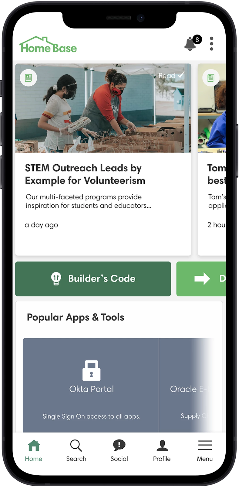
iRobot was the People’s Choice homepage winner at the Unite 22 awards. The company refreshed their homepage design in 2022, using platform analytics and employee feedback to optimize the design to meet their people’s needs better. The refresh focused on creating a greater balance between communications and more tactical information, such as the ability to request holidays, access applications, and links to essential subsites.

Standout homepage elements include:
- Apps and tools links have been moved from the bottom of the page to the top to help employees quickly navigate to other systems they rely on
- A weekly polls widget spotlights the importance of employee feedback, encouraging employees to share their views on important topics to help shape company strategy. Polls are refreshed weekly to keep employees coming back to the platform
- Due to heavy usage, the Kudos Leaderboard has also been given a higher position on the page. Employees can award their peers with Kudos as a way of saying thanks. The leaderboard tracks the most appreciated employees across the business, putting recognition at the heart of company culture
- Finally, a custom-built Newest iRoboteers widget spotlights new employees entering the business. A spokesperson from iRobot said: “When we first launched, turning a manual process into an automated one was an exciting win for our Human Resources team looking to connect everyone in a remote environment"
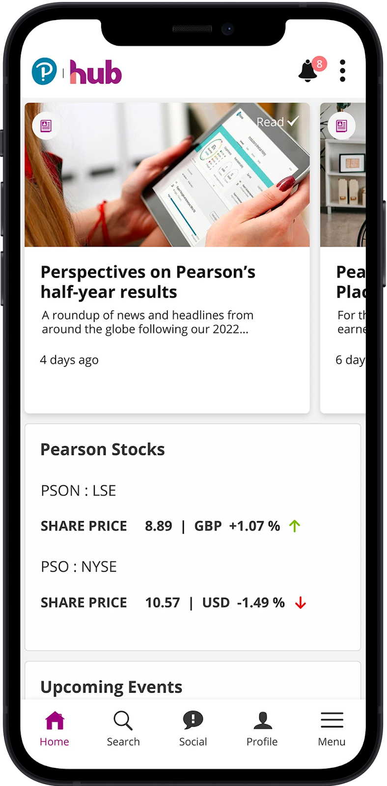
Pearson's strategic homepage
When Pearson launched their new intranet in 2022, they were struck by the exponential opportunity to improve employee experience with a single digital HQ. With so many features and possibilities, knowing where to start was the biggest challenge. Instead of throwing everything they could at employees, they took a strategic approach focused on surfacing only the most valuable information. They didn’t want to overwhelm employees, so they started small and evolved by adding new widgets over time.
The homepage is stripped back, with the fewest widgets of any of the examples shown. Pearson's design is a great reference point for companies launching a new platform, showing how keeping it simple can sometimes be the most impactful.
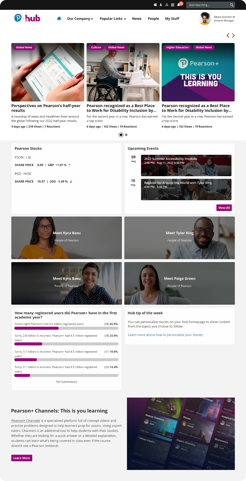
Standout homepage elements include:
- The featured news carousel surfaces a mix of global business comms and content that matches the role, location, and interests of a specific user
- Tracking stock prices is important to Pearson’s users, so an iFrame embed brings through real-time stock prices to keep employees abreast of changes
- An upcoming events widget lets employees know about events happening around the company that they can sign up for
- To support a sense of community, four employee spotlights encourage employees to get to know their colleagues from around the business
- A quiz widget gives the homepage an interactive edge as users test their knowledge. It also helps internal communicators understand topics that employees need more information on
- Finally, the ‘Hub Tip of the Week’ widget is regularly updated to provide employees with helpful guidance on maximizing the value of their new platform
How Unily helps enterprises design the perfect homepage
Unily simplifies intranet design by offering an out-of-the-box solution that rivals fully custom intranets. It makes it easier than ever to create the perfect homepage. Easily design an intranet homepage tailored to your organization’s unique needs, with complete control over its look, feel, and integrations.
Packed with customizable features like personalized dashboards, targeted content delivery, and drag-and-drop widgets, Unily empowers you to design a fast, flexible, and engaging homepage from the start.
1. Drag and drop design
Can’t code? No problem. Unily is designed so that you can create impactful pages with intuitive drag-and-drop design tools. Where custom solutions require IT support to make even the smallest changes, Unily makes designing beautiful pages simple. Choose from an ever-growing library of widgets available from our Feature Store and simply drag your widgets into the right position. Preview your designs across any device and make changes with ease.
2. Templates make it easy
Our Feature Store also includes a list of pre-made page templates that give you a running start. Whether you’re looking for something comms-focused or collaboration-centric, there are many templates to choose from. Our product developers have chosen the best widgets for the job, so all you need to do is download the template, and you’re ready to go.
3. Targeted homepages deliver unique experiences
Sometimes, your people’s needs vary so extensively that creating a one-size-fits-all design isn’t an option. In this case, you can lean on homepage targeting to create different experiences for different employees. Your home pages will automatically appear for the right audiences based on user data. You could also target based on device, allowing you to create homepage variants for mobile and desktop users.
4. Support from intranet experts
Designing the perfect intranet homepage is as much an art as a science. If you’re worried about going it alone, fear not. Unily’s Implementation Managers support enterprises from every industry to create a homepage that works for their business. After launch, Customer Success Managers help dig through data and advise on the best way to optimize homepage design over time.
Unily ranks first in all Use Cases in the 2024 Gartner® Critical Capabilities™ for Intranet Packaged Solutions.

Key takeaways: 8 intranet design best practices to help you design an award-winning solution
Now you've seen what world-class intranet design looks like, how can you start bringing some of these principles into your digital employee experience design? There are common threads we see at play in each of our designs that elevate the employee experience and help drive adoption and engagement - here are our top five takeaways
1. Design that embodies your organization.
The first key insight we can draw from the range of examples in this guide is something that every one of our featured designs addresses in some way with various approaches. Looking through the strategic objectives, business missions, and visions of the clients featured, one thing that consistently appeared was the need for our employee experience platforms to embody the culture and values of the wider organization.
From your platform’s color scheme, theming, and branding to the language you use and the stories you share, conveying your organization’s identity through design is a priority for modern enterprises and employees alike. Spotlight the conversations and connections happening across your business through design; the social side, the human side, and the culture-building all need to be represented.
In all of our designs, we can see the value placed on connecting people to each other and everything happening across your business through content. Images featuring employees and people as their subject litter content feeds, as the content they’re producing aligns with their platforms’ aim to fully embody their organizational culture.
2. Design is for people, not looking pretty
When designing an employee experience platform, it can be surprisingly easy to get bogged down in the granular details. Deciding whether your social feed sits on the left or right side of the page can take longer than you’d think, especially when decisions must run through various stakeholders and decision-makers.
If you’re tailoring your design to suit your users’ needs, the seemingly obvious but all-too-often overlooked step is to first identify these needs. Any one person within your business cannot be expected to predict every use case for your platform or anticipate the pain points and needs of your entire user base. It’s for this reason that gathering a comprehensive group of stakeholders that represent the interests of every corner of your workforce is a crucial step in any design process.
With the right people in the room, key decisions and typically cumbersome approval processes are streamlined, allowing you to focus on the actual design of your platform and avoid any bureaucracy stymying the creative process.
At its core, your intranet needs to be able to serve your employee’s daily needs, enabling them to efficiently complete their daily tasks and workload.
"Those touchpoints are now the same and that sort of wayfinding is the same because we need design to match. In the old days you wanted it to pop and stand out, but now it’s about predicting behavior and fitting the assumptions your users are making about what they’ll experience when they land on your platform."
Alex Gabelli - Senior Consultant at Unily

3. Think about cross-functionality in teams
Every user and team will be interacting with the intranet for different reasons, so when designing your intranet, it’s important to take into account how each team within the company will utilize it. When it comes to planning your intranet, HR, IT, leadership, and internal communicators all need to come together.
"The key thing is cross-functionality. It can be done by a single function, but in our case, we had three functions working together and collaborating seamlessly, as well as corporate affairs. We had IT helping with the technical aspects, the commercial excellence team bringing the digital excellence expertise, and two communications managers to help develop the top-level pages and content."
Arrigo Monti - Baker Hughes
"We had a solid team for what we were doing. Our digital transformation team was made up of four people and the product owner. We also had senior leadership buy-in, which proved to be critically helpful. With our technology partners, we had more than just tech support – there was creativity and ideation on the content side of things, as well as the employee experience side of things."
Abi Santmyer - Commonwealth Care Alliance
4. Continually request feedback along the way
It’s important you constantly listen to employee feedback throughout the design process. Think about the external part of your business - feedback from customers is always one of the most important aspects of refining your product or service. The same also applies with your employees and intranet.
"We actually hired a third party to work with us to design the intranet, and they split our employees into focus groups for people that represented the different needs for what they needed from the intranet. The third party was not just beneficial for their expertise and to aggregate the responses, but also to give our employees the ability to be honest and feel listened to. What would they want their dream internet to be?"
Abi Santmyer - Commonwealth Care Alliance
5. Take into account the future of your organization
In addition to making sure the intranet is valuable for users, it also needs to be evergreen to the organization. Employees aren’t the only ones who are constantly growing – businesses evolve yearly, and so your intranet needs to be able to expand and develop in line with it.
"First and foremost, our workplace intranet needs to evolve, grow and change with the company as we are evolving quickly. This was one of the biggest setbacks from our previous intranets and is one of the reasons why they became so outdated."
Arrigo Monti - Baker Hughes
6. Keep your frontline connected - don't forget about the mobile experience
With not all workers being based in an office, it’s essential to ensure that those on the frontline and out in the field get the same experience when using the intranet as those that are desk-based. A mobile intranet application can assist with this and drive engagement and collaboration, particularly when the mobile application offers a consumer-grade experience in terms of interface and interaction.
"Our mobile application really speaks to our focus on the roadmap – we weren’t reaching our engagement goals at all with townhalls and emails, so now we have the opportunity to engage employees with real-time information through the mobile app. The knowledge hub is the source of truth for all the tools they need. It’s all bucketed in one area that is regularly updated. The content is rich, having not just text but also video content. We have a news home that is kept freshly updated, meaning those field workers that would have used to have waited to log onto a computer at the end of the day can now access it from anywhere at any time, meaning they are able to do their work more efficiently."
Abi Santmyer - Commonwealth Care Alliance
7. Take time to consider the homepage
The intranet homepage is the first thing employees will see when they log in, and so when designing your award-winning intranet, it’s important to consider exactly what your employees will want to see and use on a daily basis.
"The feature that was most requested through the interviews and surveys was simple and easy-to-use navigation, so we kept this front of mind when designing our intranet. On our homepage, employees can easily access the key resources they use on a day-to-day basis at the top menu. Company updates, career compensation and benefits, daily managements, and IT and HR help and FAQs are all easily accessible from this top menu."
Arrigo Monti - Baker Hughes
8. Language and design go hand-in-hand
Finally, the last piece of inspiration we’re taking from our featured designs is to consider language and UX writing. All of our designs provide excellent examples of how to cut through the noise and grab the user’s attention with wording.
By naming their content widgets “Notifications” or pulling the most recent updates into a targeted “Happening Now” feed, these enterprises have all created a reason for employees to keep coming back to the intranet. It’s almost like X (Twitter), where you’re essentially plugging into a live feed of news and events from around the world in real time.
That constant feedback loop of coming back to certain channels for content is manufacturing a sense of urgency through UX writing. Calling something a notification is more immediate and grabbing than simply calling it content, so by manufacturing urgency, you’re creating engagement where previously there wasn’t any. It’s these little design opportunities to connect with users that can really elevate a platform.
"Instead of calling your latest content ‘news’, you say it’s ‘happening now’, you send a push notification to people’s phones and shout ‘look over here!’. That’s a whole different interpretation for the user than just calling it content or just calling it an article."
Alex Gabelli - Senior Consultant at Unily
Extranet design: expanding beyond your organization
Having explored the principles of effective intranet design, you can now turn your focus outward and examine the possibilities of extranet design. Designing an extranet requires a slightly different approach, as the audience and their needs often differ from those of internal users.
Here, we’ll look into the unique challenges and opportunities of extranet design and how the same user-centric principles that guide intranet design can be adapted to create a secure, intuitive, and engaging extranet experience.
What is an extranet?
Before laying the groundwork for a new component of your digital workplace, it’s important to understand what an extranet is and how it differs from an internal communications platform. In short, an extranet is an extension of an intranet. It’s a private network separate from the intranet, but the major differentiator is that an extranet is available to selected users outside of an organization. Intranets on the other hand, cater to team members within an enterprise.
Extranets take the concept of intranets to another level by enabling customers, vendors, or partners to access components of an organization’s digital workplace. Just as intranets pave the way for collaboration between team members, extranets loop in third parties to reduce silos, drive efficiencies, and facilitate seamless resource sharing.
Learn more about enterprise extranets.
What to consider when implementing an extranet
Much like introducing a new intranet software, designing an extranet that successfully engages third parties requires care and consideration. Internal stakeholders need to be able to answer the following questions in order to ensure that their organization’s extranet will maximize connectivity and pave the way for future collaborations.
1. What are the goals of the extranet?
A digital solution should never be one-size-fits-all, and extranets are no exception. Organizations can utilize external digital workplaces to fulfill a variety of different goals and objectives.
For example, e-commerce platforms may launch an extranet to efficiently manage logistics and streamline communications between suppliers, distributors, couriers, and consumers. In contrast, architecture organizations may take a more project-focused approach by using an extranet to share updates with architects, engineers, and contractors. Brainstorm specific goals and project components that will benefit from the introduction of a modern extranet.
2. Who is this extranet designed for?
Extranets can be the core from which third-party relationships flourish, so stakeholders need to carefully consider the unique users who will be utilizing this platform and tailor their digital experience accordingly. An extranet designed to provide real-time tracking data for customers might look very different from a platform dedicated to task management between multiple collaborators.
When designing an extranet, visualize the types of users who will access the platform and the specific features and capabilities that will be most valuable in order to meet their goals and expectations.
3. What kinds of collaborations and partnerships are most important to your enterprise?
Collaborations between enterprises and third parties can take a variety of different forms and modalities. One of the primary purposes of an extranet is to streamline partnerships between various organizations, so it’s important to conceptualize what these relationships look like within your organization. Features such as live data updates, searchable document libraries, and private social channels may be more or less valuable to your organization, depending on the nature of the partnerships your enterprise engages in.
4. How should user experience for your extranet differ from an intranet?
Creating a platform tailored to the needs and expectations of a user is integral to the success of any digital experience. Some organizations may opt for an extranet with many of the same features as their intranet, including social collaboration through reactions and @mentions and integrations with other tools such as Salesforce or HubSpot.
Conversely, other enterprises may decide to forgo these features and utilize the platform solely for data tracking or logistics management. Contrasting the features your intranet users need with those of third parties can help stakeholders establish a clear vision for the type of user experience their extranet needs to provide.
5. What kinds of safety and confidentiality measures should be prioritized?
Another powerful functionality of an extranet is the ability to control what information third parties can access. External user invites enable workers to collaborate with clients, partners, and suppliers by sharing sites and content directly. Invites, permissions, and access can be easily managed by stakeholders in order to protect sensitive information and restrict third-party views when needed. Depending on the nature of your enterprise’s collaborations, different security and confidentiality measures can be taken to facilitate knowledge sharing without leaking any restricted information.
6. How can stakeholders optimize the extranet adoption process?
Much like introducing a new intranet, the most successful extranet adoptions help guide the user through every step of the onboarding process. Announcements should be sent out in advance to introduce third parties to the new extranet and glimpse the features and functionalities of the digital workplace.
An internal employee or team should be appointed to serve as a point of contact once the extranet has been launched. Provide third parties with easy-to-access resources, such as a centrally located FAQ page or a bundle of explanatory articles.
To pave the way for future developments while maximizing engagement, consider adding a user experience form or survey, which can help stakeholders deliver the best digital experience possible.
7. What types of innovations will help take my extranet to the next level?
In years past, organizations looking to collaborate with third parties relied almost exclusively on Sharepoint as the foundation for their extranet. While Sharepoint provided a solution for bringing external parties up to speed, user experience was far from a priority. In contrast, modern extranets can be tailored specifically to the collaborators that matter most to your enterprise.
Companies can drive engagement and third-party user satisfaction through specialized capabilities such as social networking features that encourage cross-organization connectivity, user segmentation for targeted experiences, and external invites that enable employees to collaborate safely and securely with outside users.
Ready to elevate your intranet design and transform your digital workplace?
Effective intranet and extranet design are crucial for fostering collaboration, improving engagement, and driving productivity within and beyond your organization. By prioritizing user experience, clear navigation, and intuitive design, you can create platforms that not only meet the needs of employees but also strengthen relationships with external stakeholders.
If you're interested in adding an intranet or extranet to your organization's digital toolbox, get a free consultation today.
Workshop with an expert