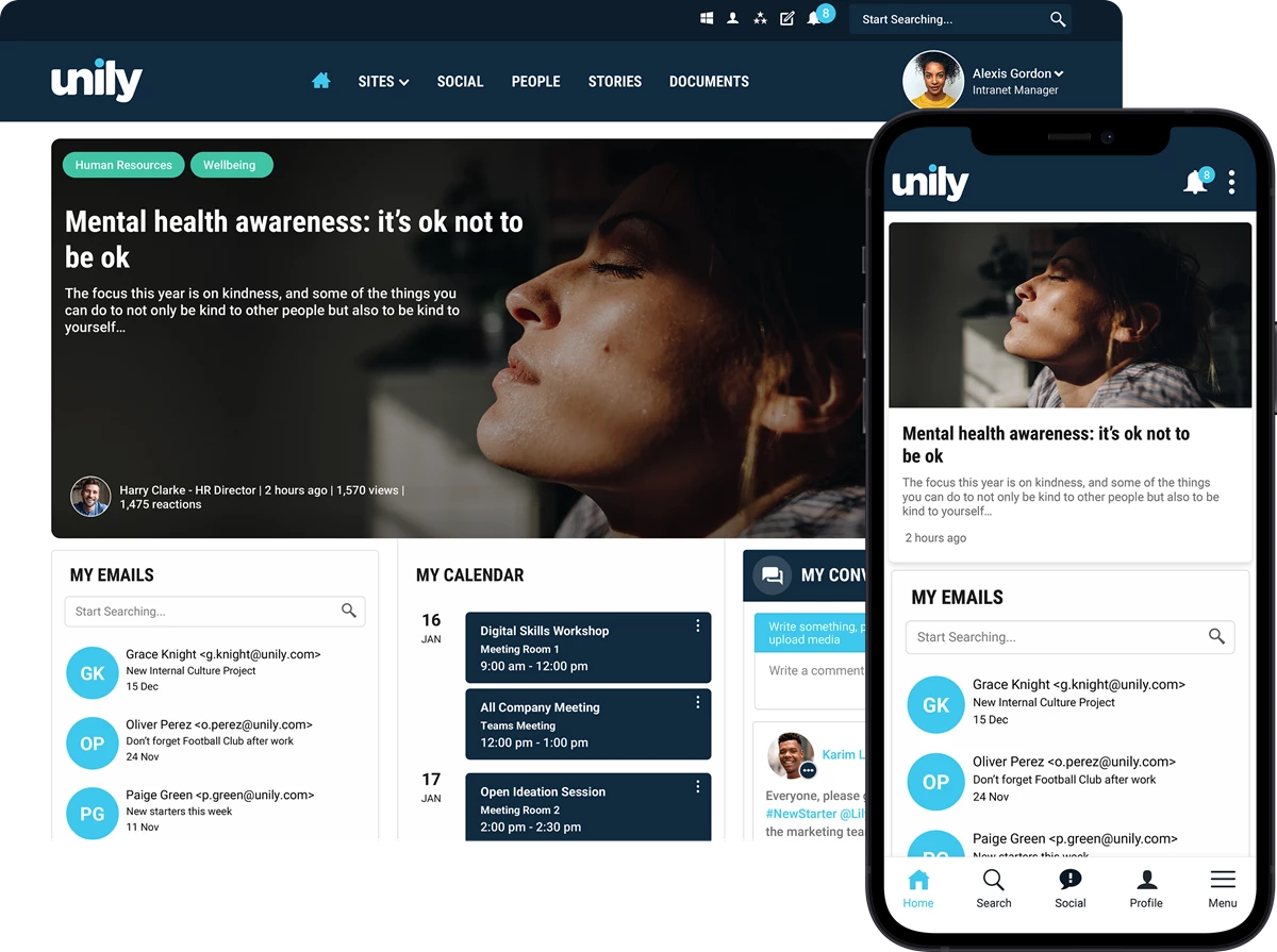
Empower your employees to stay connected wherever they are in the world, from whichever device suits their needs. Unily mobile intranets enable all of your staff to access knowledge, collaborate and stay informed whenever and wherever they choose. With Unily, mobile intranet access is provisioned through a fully responsive web interface and native mobile employee apps. This delivers a hugely powerful experience across all devices, which can be tailored to particular audiences.

"It is the first time we've had the entire intranet actually on mobile, not just a subset of it, and it's well organized so you don't get lost and you can actually find what you need. I've worked on intranets off and on for a long time and I've never seen a mobile experience this strong before."
"People want short, quick, real-time communications. That didn't exist before, today it's instant."
"By providing this new, mobile Unily intranet solution to our 44,000 colleagues, we are helping them to connect and communicate more effectively, which ultimately means a more consistent, high-quality service delivered to customers."
Frontline workers, such as those in a retail or manufacturing environment, often find it hard to engage with their wider organization due to lack of access to technology. Supplying these workers with a powerful mobile intranet experience can revolutionize engagement, providing a direct channel of communication between head office and the shop floor.
Not only does this rejuvenate the employee experience, it also provides frontline workers with access to key information and policies that can help them deliver better service to customers. With beautiful experiences across any device, the intranet is now more accessible than ever.
Engage every worker, everywhere with hyper-personalized, consumer-grade mobile experiences that empower your people to do their best work. A world-class workplace app with push notifications, native IOS & Android, powerful comms features, search and personalization.
Employees' expect messages that meet them where they are and are personalized to their needs. But when your workforce is spread across locations, made up of diverse roles, and on various devices, creating targeted experiences for every employee is nearly impossible. But it doesn't have to be.
Engagement automation brings marketing-grade campaign technology to internal communicators. Build campaigns, map content across channels, configure timelines that help you build engagement over time.
Modern intranets should be multi-device, although most are still created desktop-first. A mobile intranet refers to a corporate resources platform that anyone should be able to access from any device. A mobile intranet doesn’t necessarily mean app-based, it could just be a responsive site. Unily’s Employee App combines an award-winning intranet platform with native mobile-first employee experience software.
The difference between an Employee App and Mobile Intranet is that an Employee App is a native experience built for mobile. It uses common app functions that we know and love, and are used to experiencing as customers of other services, e.g. mobile navigation, push notifications, and UX elements like 'swipe to delete'. Mobile intranets are where a desktop intranet is reskinned to be accessible via mobile, whether that be via shortcuts or browser access, these are generally much more basic as they are typically designed desktop-first.
Unily’s employee experience platform can translate into a desktop or app experience without any change of accessibility of data, visibility of content or available integrations. Essentially whether your employee is desk-based or on the frontline, they should be able to access the exact same content.
The platform trusted by the largest workforces to deliver world-class employee experience.
Baker Hughes is the world’s leading energy technology company. With employees working across 120 different countries, Baker Hughes required a feature-rich intranet solution that would streamline communication, cultivate connectivity in times of change, and inspire future ideation.
Hong Kong flag carrier Cathay Pacific empowers 26,000 employees and 10,000 business partners with a digital workplace built on Unily's Digital Experience Cloud. The airline flies passengers to more than 230 destinations and required a sophisticated solution to support their workforce in delivering the highest service.
Flight Centre has been offering advice and making travel arrangements for customers since 1982. 36 years on, they are one of the world’s largest and most successful independent travel retailers. Discover how they powered productivity for 19,000 employees with an intranet built on Unily's Digital Experience Cloud.


